


A fancy and versatile popup plugin to create animated, customizable modal windows & dialog boxes on the page.
Features:
- Dark & light backdrops.
- Can be used as info/warning/alert/success alert dialogs.
- Supports any modal content. Not only images & text.
- 8 awesome transition effects.
- Custom action buttons.
How to use it:
1. Download and load the fancy-modal’s files in the document.
<link href="fancy-modal.css" rel="stylesheet" />
<script src="fancy-modal.js"></script>
2. Create a new fancy modal instance.
let modal = new FancyModal({
    'content': 'HTML Content Here'
});
// or
let modal = new FancyModal({
    'message': 'HTML Content Here'
});
3. Open the modal when needed.
modal.open();
4. Display an image in the modal.
let modal = new FancyModal({
    'modalType': 'image',
    'imageSrc': '1.jpg',
});
5. Determine the modal type.
- info
- warning
- alert
- success
let modal = new FancyModal({
    'modalType': 'alert',
    'message': 'This is an alert message'
});
6. Create a confirmation dialog.
let modal = new FancyModal({
    'buttonAction' : () => alert('You clicked "Delete" buton!'),
    'title':'<h3>WARNING!</h3>',
    'message':'Are you shure you want to delete this post?',
    'okBtnTxt':'Delete',
    'koBtnTxt':'Cancel'
});
7. All possible transition effects:
- fade-and-zoom
- fade-and-slide-down (default)
- fade-and-slide-left
- fade-and-slide-right
- fade-and-slide-up
- fade-and-bounce-in
- flip-card
- flip-card-drop-down
let modal = new FancyModal({
    'modalType': 'image',
    'imageSrc': '1.jpg',
    'className': 'fade-and-bounce-in'
});
8. All default configuration options.
let modal = new FancyModal({
    modalType:'info',
    className: 'fade-and-slide-down',
    content: "",
    title:false,
    message:false,
    maxWidth: 600,
    minWidth: 300,
    overlay: 'dark', // or lightbox
    buttonAction: false,
    okBtnTxt: 'Continue',
    koBtnTxt: 'Cancel'
});
See Also:
 WAI-ARIA Compliant Dialog Box In JavaScript – a11y-dialog
 iOS Style Dialog Web Component – pure-dialog
 Modern Dialog Modals with Invoker Command API
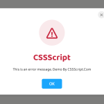 Create Custom Stylish Dialogs with SnapDialog JavaScript Library
 Easily Build Confirmation Popups with the confirmDialog.js Library
 Create Bootstrap 5 Modals Programmatically With JavaScript – bs_dialogs.js
 Moden Modal Window Using Dialog Element and CSS @starting-style
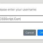 Async, Promise-based Alert/Confirm/Prompt Dialogs – Prompts.js