


Bobpop.js is a Vanilla JavaScript library for creating customizable, themeable popup windows.
It uses the Popover API and CSS anchors to generate tooltips, popovers, and alert modals on web pages.
How it works:
Bobpop.js works by dynamically creating HTML elements and styling them using JavaScript.
When you call the bobpop() function, it generates a new <div> element. This element represents the popup window.
The function then populates this <div> with the title, body content, and close button based on the options you provide.
The library utilizes the browser’s built-in Popover API for positioning and managing the popup’s visibility.
The anchor and anchorToId options allow you to attach the popup to specific elements on your page using CSS anchors.
How to use it:
1. Download the bobpop.js file and include it in your HTML:
<script src="bobpop.js"></script>
2. Now you can create a basic alert modal that appears in the center of the screen:
bobpop({
  title: 'Warning',
  body: 'This is a basic alert modal'
})
3. You can also create a tooltip or popover anchored to a specific element, triggered by events like a click:
document.getElementById('targetElement').addEventListener("click", (e) => {
  bobpop({
    title: 'Popover',
    body: 'This is a popover triggered by click',
    anchor: '--myanchor',
    anchorToId: 'targetElement',
    anchorInsetArea: 'end',
    tooltipArrow: 'left top'
  })
})
4. All possible options to control over the appearance and behavior of your popups.
id: DOM ID for the popuptype: Dismissal behavior (auto or manual)title: Header title (supports HTML)body: Popup content (supports HTML)closeButtonText: Text for the close buttonhideCloseButton: Option to hide the close buttonborder,borderRadius,padding,color,background,boxShadow: Styling optionsposition,margin: Positioning optionstheme: ‘dark’, ‘light’, ‘modern’, ‘fancy’, ‘pastel’, ‘ocean’, ‘nature’, ‘warm’, ‘sleek’, ‘retro’, ‘elegant’, ‘bootstrap’, ‘material’, ‘tailwind’anchor,anchorToId,anchorBottom,anchorInsetArea: Anchoring optionstooltipArrow,tooltipArrowColor: Tooltip arrow customization
bobpop({
  id: 'bobpop',
  type: 'auto',
  title: '',
  titleTextAlign: 'left',
  titleBorderSize: '',
  titleBorderType: '',
  titleBorderColor: '',
  titleMargin: '.5rem 0',
  titlePadding: '0px 0px',
  body: '',
  bodyTextAlign: '',
  maxHeight: '85svh',
  maxWidth: '90vw',
  scrollbarWidth: 'thin',
  border: 'none',
  padding: '1rem',
  borderRadius: '15px',
  fontFamily: '',
  color: '',
  background: '',
  boxShadow: '0 4px 8px rgba(0, 0, 0, 0.5)',
  backdrop: 'rgb(107 114 128 / .5)',
  backdropBlur: false,
  backdropBlurPx: '4',
  hideCloseButton: false,
  showOkButton: false,
  okButtonText: 'Ok',
  closeButtonText: `
  <svg xmlns="http://www.w3.org/2000/svg" viewBox="0 0 24 24" width="1em" height="1em" aria-hidden="true" focusable="false" style="stroke: red; stroke-width: 3; stroke-linecap: round; display: inline-block; vertical-align: middle;">
  <line x1="4" y1="4" x2="20" y2="20"></line>
  <line x1="20" y1="4" x2="4" y2="20"></line>
  </svg>
  `,
  position: 'fixed',
  anchor: '',
  anchorToId: '',
  anchorMargin: '.5rem 0',
  anchorPositionArea: 'bottom',
  margin: '',
  tooltipArrow: '',
  tooltipArrowColor: 'black',
  transition: true,
  theme: '',
  bobpopOnOpen: () => {},
  bobpopOnClose: () => {}
}})
Changelog:
11/29/2024
- Changed default bodyTextAlign to center. Added transitionType and a bunch of transitions to choose from.
11/27/2024
- Made the chat bubble tail match the bobpop background
11/23/2024
- Prefer dark theme if not theme is given and user prefers dark
11/16/2024
- changed style defaults, changed some px to rem, added transition (and t/f option), changed closed X button to svg, added titleMargin option
09/15/2024
- A bit more pre-defined styles and transition detection before removing from DOM
See Also:
 Advanced Toast/Tooltip/Popover/Confirm/Modal Notification Library – toast-anchor
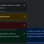 Advanced Alert Notification System For Bootstrap 5 – AvalynxAlert.js
 Create Dynamic Draggable Alert/Confirm Popups – webcimes-modal
 Customizable Alert/Confirm Modal Library – modal-alert.js
 Lightweight JavaScript Notification System – Simple Display Alert
 Simple Confirmation Dialogs on Click – Bootstrap 5 Confirm Popover
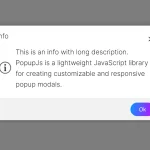 Minimal Alert & Confirmation Modals in JavaScript – PopupJs.js
 Custom Tooltips and Popovers in JavaScript – show-tips