


A pure HTML / CSS based radial menu that expands / collapses menu items sequentially with smooth CSS3 animations.
How to use it:
Include the optional Font Awesome 4 for menu icons.
<link rel="stylesheet" href="https://netdna.bootstrapcdn.com/font-awesome/4.3.0/css/font-awesome.min.css">
Uses checkbox and label trick to create a toggle button that allows you to open / close the radial menu.
<input id="check" type="checkbox">
<label class="main" for="check">
  <div class="title">
    <i class="fa fa-bars"></i>
  </div>
</label>
Create menu items displayed around the toggle button.
<div class="container">
  <a class="plate" href="#">
    <i class="fa fa-tumblr"></i>
  </a>
  <a class="plate" href="#">
    <i class="fa fa-pinterest"></i>
  </a>
  <a class="plate" href="#">
    <i class="fa fa-instagram"></i>
  </a>
  <a class="plate" href="h#">
    <i class="fa fa-linkedin"></i>
  </a>
  <a class="plate" href="#">
    <i class="fa fa-github"></i>
  </a>
  <a class="plate" href="#" target="_top">
    <i class="fa fa-google-plus"></i>
  </a>
  <a class="plate" href="#" target="_top">
    <i class="fa fa-facebook"></i>
  </a>
  <a class="plate" href="#">
    <i class="fa fa-twitter"></i>
  </a>
</div>
Enable the radial menu with CSS/CSS3 magic.
#check { display: none; }
.main,
.container {
  margin: auto;
  position: absolute;
  top: 0;
  right: 0;
  bottom: 0;
  left: 0;
  width: 100px;
  height: 100px;
  border-radius: 50%;
}
.main {
  background-color: #B81365;
  box-shadow: 1px 2px 2px rgba(0, 0, 0, 0.35);
  cursor: pointer;
  z-index: 50;
}
.main:hover { background-color: #cf1572; }
.main:active {
  box-shadow: 1px 2px 2px rgba(0, 0, 0, 0.35), inset 1px 2px 2px rgba(0, 0, 0, 0.35);
  background-color: #a11158;
}
.main .title {
  margin: auto;
  position: absolute;
  top: 0;
  right: 0;
  bottom: 0;
  left: 0;
  width: 100%;
  height: 80px;
  font-size: 3em;
  line-height: 80px;
  text-align: center;
  color: #fafafa;
}
.container { z-index: 10; }
.plate {
  margin: auto;
  position: absolute;
  top: 0;
  right: 0;
  bottom: 0;
  left: 0;
  width: 50px;
  height: 50px;
  opacity: 0;
  border-radius: 50%;
  box-shadow: 1px 2px 2px rgba(0, 0, 0, 0.35);
  -webkit-transition: all 0.4s ease-in;
  -moz-transition: all 0.4s ease-in;
  transition: all 0.4s ease-in;
}
.plate i {
  width: 100%;
  font-size: 2em;
  line-height: 53px;
  text-align: center;
  color: #333;
}
.plate:hover i { color: #111; }
.plate:nth-of-type(1) {
  background-color: rgba(109, 231, 200, 0.3);
  -webkit-transition-delay: 0s;
  -moz-transition-delay: 0s;
  transition-delay: 0s;
}
.plate:nth-of-type(2) {
  background-color: rgba(243, 156, 80, 0.1);
  -webkit-transition-delay: 0.1s;
  -moz-transition-delay: 0.1s;
  transition-delay: 0.1s;
}
.plate:nth-of-type(3) {
  background-color: rgba(247, 80, 173, 0.1);
  -webkit-transition-delay: 0.2s;
  -moz-transition-delay: 0.2s;
  transition-delay: 0.2s;
}
.plate:nth-of-type(4) {
  background-color: rgba(80, 128, 136, 0.5);
  -webkit-transition-delay: 0.3s;
  -moz-transition-delay: 0.3s;
  transition-delay: 0.3s;
}
.plate:nth-of-type(5) {
  background-color: rgba(191, 95, 80, 0.9);
  -webkit-transition-delay: 0.4s;
  -moz-transition-delay: 0.4s;
  transition-delay: 0.4s;
}
.plate:nth-of-type(6) {
  background-color: rgba(101, 128, 216, 0.7);
  -webkit-transition-delay: 0.5s;
  -moz-transition-delay: 0.5s;
  transition-delay: 0.5s;
}
.plate:nth-of-type(7) {
  background-color: rgba(210, 80, 80, 0.2);
  -webkit-transition-delay: 0.6s;
  -moz-transition-delay: 0.6s;
  transition-delay: 0.6s;
}
.plate:nth-of-type(8) {
  background-color: rgba(114, 89, 202, 0.9);
  -webkit-transition-delay: 0.7s;
  -moz-transition-delay: 0.7s;
  transition-delay: 0.7s;
}
#check:checked ~ .main + .container .plate { opacity: 1; }
#check:checked ~ .main + .container .plate:nth-of-type(1) { top: -180%; }
#check:checked ~ .main + .container .plate:nth-of-type(2) {
  top: -130%;
  right: -130%;
}
#check:checked ~ .main + .container .plate:nth-of-type(3) { right: -180%; }
#check:checked ~ .main + .container .plate:nth-of-type(4) {
  right: -130%;
  bottom: -130%;
}
#check:checked ~ .main + .container .plate:nth-of-type(5) { bottom: -180%; }
#check:checked ~ .main + .container .plate:nth-of-type(6) {
  bottom: -130%;
  left: -130%;
}
#check:checked ~ .main + .container .plate:nth-of-type(7) { left: -180%; }
#check:checked ~ .main + .container .plate:nth-of-type(8) {
  top: -130%;
  left: -130%;
}
See Also:
 Pure CSS Radial Menu with Native Select Element
 Build Modern Accessible Circular Menus with Pure CSS – Radial Menu
 Interactive Radial Menus in JavaScript – Orbit Menu
 Beautiful Radial Popup Menu With JavaScript And CSS
 Versatile Radial Menu In Pure CSS – radialMenu.css
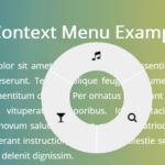 Touch-enabled Radial Context Menu In Pure JavaScript – radialMenu
 Multi-level Radial Tree Menu In Pure CSS
 Corner Radial Menu In JavaScript/CSS/SVG
Thanks for this button menu. Its one of the few radius menus that will work with Booststrap 4 alpha 2.