


In this post we’re going to create a cool morphing button that expands into a square menu using CSS3 transitions and transforms.
How to use it:
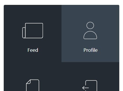
Create a morphing square menu using a nested nav list.
<nav>
  <ul>
    <li><a href="#" class="feed-btn"><i></i>Feed</a></li>
    <li><a href="#" class="profile-btn"><i></i>Profile</a></li>
    <li><a href="#" class="draft-btn"><i></i>New draft</a></li>
    <li><a href="#" class="signout-btn"><i></i>Sign out</a></li>
  </ul>
</nav>
The core CSS/CSS3 styles.
nav {
  width: 80px;
  height: 80px;
  position: fixed;
  top: 40px;
  left: 40px;
  background: url("[email protected]") 0 0 no-repeat #242b33;
  -moz-background-size: 80px;
  -o-background-size: 80px;
  -webkit-background-size: 80px;
  background-size: 80px;
  border-radius: 4px;
  box-shadow: 0 2px 3px 0 rgba(0, 0, 0, 0.25);
  cursor: pointer;
  overflow: hidden;
}
nav ul { width: 400px; }
nav li {
  width: 200px;
  height: 200px;
  float: left;
  text-align: center;
  opacity: 0;
  -moz-transform: translateY(80px);
  -ms-transform: translateY(80px);
  -webkit-transform: translateY(80px);
  transform: translateY(80px);
}
nav a {
  display: block;
  width: 100%;
  height: 100%;
  font-family: 'Source Sans Pro';
  color: #fff;
  font-weight: 400;
  text-decoration: none;
}
nav i {
  display: block;
  width: 100px;
  height: 100px;
  margin: 40px auto 10px;
  background: center no-repeat;
  background-size: 100%;
}
nav .feed-btn i { background-image: url("icon-feed.svg"); }
nav .profile-btn i {
  background-image: url("icon-profile.svg");
  background-size: 115%;
}
nav .draft-btn i { background-image: url("icon-draft.svg"); }
nav .signout-btn i { background-image: url("icon-signout.svg"); }
nav:hover {
  width: 400px;
  height: 400px;
  background-position: 0 -80px;
}
Give the cool morphing effect to the square menu using CSS3 transitions and transforms
nav:hover {
  width: 400px;
  height: 400px;
  background-position: 0 -80px;
}
nav:hover li {
  opacity: 1;
  -moz-transform: translateY(0px);
  -ms-transform: translateY(0px);
  -webkit-transform: translateY(0px);
  transform: translateY(0px);
}
nav:hover li:hover { background: #394451; }
nav { transition: all 0.6s cubic-bezier(0.19, 1, 0.22, 1); }
nav li { transition: transform 0.6s cubic-bezier(0.19, 1, 0.22, 1), opacity 0.6s cubic-bezier(0.19, 1, 0.22, 1); }
nav li:nth-child(1) {
  -moz-transition-delay: 0.07s;
  -o-transition-delay: 0.07s;
  -webkit-transition-delay: 0.07s;
  transition-delay: 0.07s;
}
nav li:nth-child(2) {
  -moz-transition-delay: 0.14s;
  -o-transition-delay: 0.14s;
  -webkit-transition-delay: 0.14s;
  transition-delay: 0.14s;
}
nav li:nth-child(3) {
  -moz-transition-delay: 0.21s;
  -o-transition-delay: 0.21s;
  -webkit-transition-delay: 0.21s;
  transition-delay: 0.21s;
}
nav li:nth-child(4) {
  -moz-transition-delay: 0.28s;
  -o-transition-delay: 0.28s;
  -webkit-transition-delay: 0.28s;
  transition-delay: 0.28s;
}
.
See Also:
 Modern Split View In JavaScript – Split.js
 Minimal HTML5 Form Validator In Vanilla JavaScript – Pristine
 Cool Image Slider Carousel With JavaScript And Tailwind CSS
 Lightweight Browser Fingerprint Library – Thumbmark.js
 Accessible Dual-Thumb Range Slider for Web & Mobile – DoubleRange
 CSS Only Content Slider – CSS Slider
 Performant Accessible Video Embedding with youtube-vimeo-embed
 Apply Cascading Animations To Elements With JavaScript – CascadeJS