


A small star rating component which uses Font Awesome for rating symbols, built using pure CSS and check inputs.
How to use it:
Load the needed Font Awesome iconic font in the header of the webpage.
<link rel="stylesheet" href="font-awesome.min.css">
Create 5 checkboxes & labels for the 5-star rating component.
<input type="checkbox" id="st1" value="1" />
<label for="st1"></label>
<input type="checkbox" id="st2" value="2" />
<label for="st2"></label>
<input type="checkbox" id="st3" value="3" />
<label for="st3"></label>
<input type="checkbox" id="st4" value="4" />
<label for="st4"></label>
<input type="checkbox" id="st5" value="5" />
<label for="st5"></label>
Replace the checkboxes with star icons and style the rating component with the following CSS styles:
input {
  border: 0;
  width: 1px;
  height: 1px;
  overflow: hidden;
  position: absolute !important;
  clip: rect(1px 1px 1px 1px);
  clip: rect(1px, 1px, 1px, 1px);
  opacity: 0;
}
label {
  position: relative;
  float: right;
  color: #C8C8C8;
}
label:before {
  margin: 5px;
  content: "\f005";
  font-family: FontAwesome;
  display: inline-block;
  font-size: 1.5em;
  color: #ccc;
  -webkit-user-select: none;
  -moz-user-select: none;
  user-select: none;
}
input:checked ~ label:before {
  color: #FFC107;
}
label:hover ~ label:before {
  color: #ffdb70;
}
label:hover:before {
  color: #FFC107;
}
See Also:
 Five-Star Rating Web Component in JavaScript
 Select Box Based Star Rating JavaScript Library – star-rating.js
 Customizable 5-Star Rating System In Pure CSS/SCSS
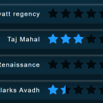 CSS Only Animated Rating Bar
 Tiny Star Rating System In Vanilla JavaScript
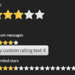 Interactive Star Rating Component With Pure JavaScript – rater-js
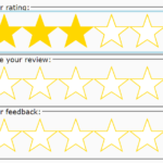 Accessible Star Rating Control Using Radio Buttons
 Accessible Star Rating System In Pure CSS – Starability.css
Like it – thx! But the “point” – to store and update the results – is missing!
You used input type=checkbox – in the demo, the control “sticks”… you can’t change your rating. It should be input type=radio.
thx Rasmus
i modified like this