


A pure CSS star rating system built using radio buttons and :checked & :hover pseudo class selectors.
How to use it:
Create a five star rating system using radio buttons.
<form id="ratingsForm">
  <div class="stars">
    <input type="radio" name="star" class="star-1" id="star-1">
    <label class="star-1" for="star-1">1</label>
    <input type="radio" name="star" class="star-2" id="star-2">
    <label class="star-2" for="star-2">2</label>
    <input type="radio" name="star" class="star-3" id="star-3">
    <label class="star-3" for="star-3">3</label>
    <input type="radio" name="star" class="star-4" id="star-4">
    <label class="star-4" for="star-4">4</label>
    <input type="radio" name="star" class="star-5" id="star-5">
    <label class="star-5" for="star-5">5</label>
    <span></span>
  </div>
</form>
Add the rating symbol as a background image to the rating system.
form .stars {
  background: url("stars.png") repeat-x 0 0;
  width: 150px;
  margin: 0 auto;
}
The core CSS rules for the rating system.
form .stars input[type="radio"] {
  position: absolute;
  opacity: 0;
  filter: alpha(opacity=0);
}
form .stars input[type="radio"].star-5:checked ~ span { width: 100%; }
form .stars input[type="radio"].star-4:checked ~ span { width: 80%; }
form .stars input[type="radio"].star-3:checked ~ span { width: 60%; }
form .stars input[type="radio"].star-2:checked ~ span { width: 40%; }
form .stars input[type="radio"].star-1:checked ~ span { width: 20%; }
form .stars label {
  display: block;
  width: 30px;
  height: 30px;
  margin: 0!important;
  padding: 0!important;
  text-indent: -999em;
  float: left;
  position: relative;
  z-index: 10;
  background: transparent!important;
  cursor: pointer;
}
form .stars label:hover ~ span { background-position: 0 -30px; }
form .stars label.star-5:hover ~ span { width: 100% !important; }
form .stars label.star-4:hover ~ span { width: 80% !important; }
form .stars label.star-3:hover ~ span { width: 60% !important; }
form .stars label.star-2:hover ~ span { width: 40% !important; }
form .stars label.star-1:hover ~ span { width: 20% !important; }
form .stars span {
  display: block;
  width: 0;
  position: relative;
  top: 0;
  left: 0;
  height: 30px;
  background: url("stars.png") repeat-x 0 -60px;
  -webkit-transition: -webkit-width 0.5s;
  -moz-transition: -moz-width 0.5s;
  -ms-transition: -ms-width 0.5s;
  -o-transition: -o-width 0.5s;
  transition: width 0.5s;
}
See Also:
 Five-Star Rating Web Component in JavaScript
 Select Box Based Star Rating JavaScript Library – star-rating.js
 Customizable 5-Star Rating System In Pure CSS/SCSS
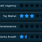 CSS Only Animated Rating Bar
 Tiny Star Rating System In Vanilla JavaScript
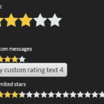 Interactive Star Rating Component With Pure JavaScript – rater-js
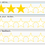 Accessible Star Rating Control Using Radio Buttons
 Accessible Star Rating System In Pure CSS – Starability.css