Mobile-first Morphing Navigation Menu With JavaScript And CSS3

A mobile-first fullscreen hamburger navigation system that uses CSS3 transforms to achieve the morphing effects when opening and closing.


A mobile-first fullscreen hamburger navigation system that uses CSS3 transforms to achieve the morphing effects when opening and closing.

mcx-dialog-mobile is a pure JavaScript plugin to create mobile-first, iOS-inspired dialog popups (alert/confirm dialog, action sheet, loading spinner, toast notification) on your web app.

wenk.css is an extremely light CSS library helps you create CSS3 animated tooltips with configurable sizes and positions attaching to any DOM elements.

A modern sticky off-canvas sidebar navigation where the users are able to switch between page sections with a smooth transition effect by clicking nav links.

Tinycon is a small yet useful JavaScript favicon manipulation library which adds custom, animated, dynamic badges to your browser’s favicon.
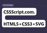
Apply a smooth, gooey, rounded corners to the background of your text using SVG filters.
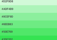
Reshader is a lightweight and customizable color palette generator that provides a function to extract the shades of a color you specify.

Hexi-Flexi Grid is an SCSS component used to render a responsive, flexible, customizable hexagon layout using CSS grid layout.
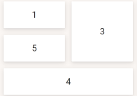
iota.css is a lightweight CSS layout library which makes it easier to generate flexible, responsive grid layout using CSS grid properties.

normalize.email.css is a lightweight, cross-platform CSS reset specifically designed for emails and newsletters to reset the styling of HTML elements.