


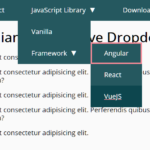
navigataur.css is a pure CSS responsive navigation solution that converts the regular navbar into a dropdown menu with a toggle button when the screen size reaches a specific breakpoint.
Based on checkbox input and CSS media queries.
How to use it:
1. Download and place the stylesheet navigataur.css in the header of the document.
<link href="navigataur.css" rel="stylesheet" />
2. Create a checkbox input for the menu toggle behavior.
<input type="checkbox" id="toggle" />
3. The HTML structure for the responsive navbar.
<div>
  <label for="toggle" class="toggle" data-open="Main Menu" data-close="Close Menu" onclick></label>
  <ul class="menu">
    <li><a href="#">CSS</a></li>
    <li><a href="#">Script</a></li>
    <li><a href="#">COM</a></li>
    <li><a href="#">Example</a></li>
  </ul>
</div>
4. Override the default styles & breakpoints of the responsive menu.
- Media queries should be edited in both style sections if you require a different breakpoint for your navigation.
- Toggle class & menu anchor tags in list items have box-sizing: border-box style property to allow padding inside the container without conflicting with the layout.
@media only screen and (max-width: 768px){
  .menu{
    background: #FFFFFF;
    border-top: 1px solid #51C1F1;
  }

  .menu, .menu > li, .menu > li > a{
    height: auto;
  }

  .menu > li > a{
    padding: 15px 15px;
  }

  .menu > li > a:hover, .menu > li > a:focus{
    background: #F2F2F2;
    box-shadow: inset 5px 0px #51C1F1;
    padding: 15px 15px 15px 25px;
  }

  .toggle:after {
    content: attr(data-open);
    display: block;
    width: 200px;
    margin: 33px 0;
    padding: 10px 50px;
    background: #51C1F1;
    -webkit-border-radius: 2px;
    border-radius: 2px;
    text-align: center;
    font-size: 12px;
    color: #FFFFFF;
    -webkit-transition: all 0.5s linear;
    -moz-transition: all 0.5s linear;
    -o-transition: all 0.5s linear;
    transition: all 0.5s linear;
    -webkit-box-sizing: border-box;
    -moz-box-sizing: border-box;
    box-sizing: border-box;
  }

  .toggle:hover:after{
    background: #45ABD6;
  }

  #toggle:checked + div .toggle:after{
    content: attr(data-close);
  }
}
See Also:
 WCAG Compliant Responsive Dropdown Navigation – accessible-menu
 Accessible Dropdown Nav With Vanilla JavaScript – Clicky Menus
 Responsive Accessible Dropdown Menu Template with Vanilla JavaScript
 Modern One Page Scroll Web Template with Responsive Nav
 Responsive Dropdown/Off-canvas Navigation In Vanilla JavaScript – Menue
 Responsive Sliding Hamburge Menu System
 Responsive Sticky Mega Menu – SnazzyMenu.js
 Responsive Dropdown Mega Menu In JavaScript