


A vanilla JS color picker that allows you to pick an RGB color by moving the Red/Green/Blue sliders or entering numbers between 0 to 255.
How to use it:
Create the HTML for the color picker app.
<div class="color-slider-wrap">
  <div class="color-wrap">
      <div id="color-display"></div>
  </div>
  <div class="sliders">
      <div>
          <label for="red">Red</label>
          <input type="number" id="redNum">
          <input value="200" type="range" min="0" max="255" id="red">
      </div>
      <div>
          <label for="green">Green</label>
          <input type="number" id="greenNum">
          <input value="130" type="range" min="0" max="255" id="green">
      </div>
      <div>
          <label for="blue">Blue</label>
          <input type="number" id="blueNum">
          <input  value="180" type="range" min="0" max="255" id="blue">
      </div>
  </div>
</div>
Load the main JavaScript right before the closing body tag.
<script src="js/main.js"></script>
The necessary CSS styles.
/* RGB title */
span:nth-child(1){
  color: #ff0000;
}
span:nth-child(2){
  color: #00ff00;
}
span:nth-child(3){
  color: #0000ff;
}
.wrap{
  padding: 10px;
  width: 500px;
  margin: 0 auto;
}
/* color display */
#color-display{
  padding: 40px;
  box-shadow: 0 0 8px #aaaaaa;
  border-radius: 10px;
}
#color-display::before{
  content: 'Move sliders to change Color or enter numbers between 0 to 255 in the number fields';
  color: #ffffff;
  text-shadow: 0 0 4px #333333;
}
/* labels */
label{
  padding: 10px;
  width: 50px;
  text-align: center;
  color: #ffffff;
  margin: 4px;
  border-radius: 6px;
  box-shadow: inset 0 0 2px #333333;
}
input[type=number], label{
  display: inline-block;
}
/* number input */
.sliders input[type=number]{
  text-align: center;
  width: 50px;
  padding: 10px 0 10px 10px;
  background: #ffffff;
  margin: 0 10px 0 4px;
  outline: none;
  border: 2px solid transparent;
  border-radius: 6px;
  transition: border 0.2s ease;
  box-shadow: 0 0 2px #333333;
}
.sliders input[type=number]:focus{
  border: 2px solid #508cfc;
}
/* color sliders */
.sliders{
  margin-top: 20px;
  padding: 20px;
  box-shadow: 0 0 8px #aaaaaa;
  border: 1px solid #f4f4f4;
  background: #f1f1f1;
  border-radius: 10px;
}
.sliders div{
  padding: 4px;
}
/* range sliders */
.sliders input[type=range]{
  height: 8px;
  border-radius: 10px;
  outline: none;
  width: 100%;
  box-shadow: 0 0 2px #444444, inset 0 0 2px #444444;
}
.sliders input[type=range], input[type=range]::-webkit-slider-thumb{
  appearance: none;
  -webkit-appearance: none;
}
/* slider thumb */
.sliders input[type=range]::-webkit-slider-thumb{
  height: 20px;
  width: 24px;
  border-radius: 20%;
  cursor: pointer;
  background: #cccccc;
  border: 2px solid #eeeeee;
  box-shadow: 0 0 4px #444444, inset 0 0 2px #444444;
}
Changelog:
02/09/2019
- JS Update
See Also:
 Modern Color Picker Component: Support for OKLCH, P3, and More – css-color-component
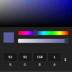 Mobile-friendly & Keyboard Accessible Color Picker – Alwan
 Accessible Color Picker – Coloris.js
 Modern Feature-Rich Color Picker in Vanilla JavaScript
 Customizable Color Picker For The Web – Grid Color Picker
 Lightweight & Fast Color Picker Web Component – color-dialog-box
 Elegant Mobile-compatible Color Picker Component – pickr
 Customizable Mobile-friendly Color Picker – jscolor