


A toggle button built with HTML5 and CSS3 that converts a checkbox input field to an animated toggle switcher as you seen in iOS. The toggle uses svg for toggle icons so it only works on modern browsers that support Html 5 SVG element and CSS3 properties.
How to use it:
Markup html structure.
<div class="toggle-btn">
<div class="toggle-round">
<input type="checkbox" name="round-test" id="round-test" />
<label for="round-test"></label>
<figure class="icon-unchecked"> <svg xmlns="http://www.w3.org/2000/svg" xmlns:sketch="http://www.bohemiancoding.com/sketch/ns" xmlns:xlink="http://www.w3.org/1999/xlink" height="16px" version="1.1" viewBox="0 0 16 16" width="16px">
<g fill="none" fill-rule="evenodd" id="Icons with numbers" stroke="none" stroke-width="1">
<g fill="#000000" id="Group" transform="translate(-144.000000, -480.000000)">
<path d="M144,480 L160,480 L160,496 L144,496 Z M145,481 L145,495 L159,495 L159,481 Z M145,481" id="Rectangle 152 copy" />
</g>
</g>
</svg> </figure>
<figure class="icon-checked">
<svg height="16px" version="1.1" viewBox="0 0 16 16" width="16px" xmlns="http://www.w3.org/2000/svg" xmlns:sketch="http://www.bohemiancoding.com/sketch/ns" xmlns:xlink="http://www.w3.org/1999/xlink">
<title/>
<defs/>
<g fill="none" fill-rule="evenodd" id="Icons with numbers" stroke="none" stroke-width="1">
<g fill="#000000" id="Group" transform="translate(0.000000, -432.000000)">
<path d="M0,432 L7,432 L7,439 L0,439 Z M9,432 L16,432 L16,439 L9,439 Z M0,441 L7,441 L7,448 L0,448 Z M9,441 L16,441 L16,448 L9,448 Z M9,441" id="Rectangle 184"/>
</g>
</g>
</svg> </div>
</div>
The CSS styles.
.toggle-btn {
position: relative;
max-width: 200px;
height: 50px;
height: 50px;
line-height: 50px;
}
.toggle-btn .toggle-round {
margin: 0 auto;
width: 75%;
height: 100%;
line-height: 50px;
border: 10px solid #FFFFFF;
-webkit-border-radius: 50px;
-moz-border-radius: 50px;
border-radius: 50px;
}
.toggle-btn input[type="checkbox"] {
position: absolute;
left: -2500px;
}
.toggle-btn label {
display: block;
position: absolute;
width: 100%;
height: 100%;
cursor: pointer;
}
.toggle-btn .toggle-round label:before {
position: absolute;
content: " ";
top: 50%;
margin-top: -18px;
margin-left: 10px;
display: inline-block;
background: #FFFFFF;
width: 36px;
height: 36px;
-webkit-border-radius: 36px;
-moz-border-radius: 36px;
border-radius: 36px;
-webkit-transform: translate3d(0, 0, 0);
-moz-transform: translate3d(0, 0, 0);
transform: translate3d(0, 0, 0);
-webkit-transition: -webkit-transform 750ms cubic-bezier(0.390, 0.575, 0.565, 1.000);
-moz-transition: -moz-transform 750ms cubic-bezier(0.390, 0.575, 0.565, 1.000);
transition: transform 750ms cubic-bezier(0.390, 0.575, 0.565, 1.000);
}
.toggle-btn input[type="checkbox"]:checked ~ label:before {
-webkit-transform: translate3d(95px, 0, 0);
-moz-transform: translate3d(95px, 0, 0);
transform: translate3d(95px, 0, 0);
}
.toggle-btn figure {
position: absolute;
top: 50%;
margin-top: 2px;
}
.toggle-btn figure g {
-webkit-transition: fill 750ms cubic-bezier(0.390, 0.575, 0.565, 1.000);
-moz-transition: fill 750ms cubic-bezier(0.390, 0.575, 0.565, 1.000);
transition: fill 750ms cubic-bezier(0.390, 0.575, 0.565, 1.000);
}
.toggle-btn figure.icon-unchecked {
left: -65px;
}
.toggle-btn figure.icon-checked {
right: -65px;
}
.toggle-btn figure.icon-unchecked g {
fill: rgba(0,0,0, 0.5);
}
.toggle-btn figure.icon-checked g {
fill: #FFFFFF;
}
.toggle-btn input[type="checkbox"]:checked ~ figure.icon-unchecked g {
fill: #FFFFFF;
}
.toggle-btn input[type="checkbox"]:checked ~ figure.icon-checked g {
fill: rgba(0,0,0, 0.5);
}
See Also:
 Create Smooth Toggle Button Animations with View Transition API
 Animated Segmented Control with Radio Buttons and CSS3
 Build OpenAI.fm-style Button Groups with Pure CSS
 Simple CSS Toggle Switch Library – a8z
 12 Animated Accessible Toggle Controls – Theme Toggles
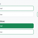 Convert Checkboxes & Radio Buttons Into Grouped Buttons – boxed-check.css
 Create Custom Switches With Checkboxes – Toggle Switchy
 Create Segmented Controls With Radio Buttons – Toggle Radios