


A set of cool radio buttons with cool CSS3 based check and hover animations inspired by Google’s new Material Design. Created by jchristianhall.
How to use it:
Create a regular radio input inside a label element.
<label class="radio"><input id="radio1" type="radio" name="radios" checked><span class="outer"><span class="inner"></span></span>Label 1</label>
Set the animations in the CSS.
@-webkit-keyframes
cardEnter {  0%, 20%, 40%, 60%, 80%, 100% {
 -webkit-transition-timing-function: cubic-bezier(0.215, 0.61, 0.355, 1);
 transition-timing-function: cubic-bezier(0.215, 0.61, 0.355, 1);
}
 0% {
 opacity: 0;
 -webkit-transform: scale3d(0.3, 0.3, 0.3);
}
 20% {
 -webkit-transform: scale3d(1.1, 1.1, 1.1);
}
 40% {
 -webkit-transform: scale3d(0.9, 0.9, 0.9);
}
 60% {
 opacity: 1;
 -webkit-transform: scale3d(1.03, 1.03, 1.03);
}
 80% {
 -webkit-transform: scale3d(0.97, 0.97, 0.97);
}
 100% {
 opacity: 1;
 -webkit-transform: scale3d(1, 1, 1);
}
}
@keyframes
cardEnter {  0%, 20%, 40%, 60%, 80%, 100% {
 -webkit-transition-timing-function: cubic-bezier(0.215, 0.61, 0.355, 1);
 transition-timing-function: cubic-bezier(0.215, 0.61, 0.355, 1);
}
 0% {
 opacity: 0;
 -webkit-transform: scale3d(0.3, 0.3, 0.3);
 transform: scale3d(0.3, 0.3, 0.3);
}
 20% {
 -webkit-transform: scale3d(1.1, 1.1, 1.1);
 transform: scale3d(1.1, 1.1, 1.1);
}
 40% {
 -webkit-transform: scale3d(0.9, 0.9, 0.9);
 transform: scale3d(0.9, 0.9, 0.9);
}
 60% {
 opacity: 1;
 -webkit-transform: scale3d(1.03, 1.03, 1.03);
 transform: scale3d(1.03, 1.03, 1.03);
}
 80% {
 -webkit-transform: scale3d(0.97, 0.97, 0.97);
 transform: scale3d(0.97, 0.97, 0.97);
}
 100% {
 opacity: 1;
 -webkit-transform: scale3d(1, 1, 1);
 transform: scale3d(1, 1, 1);
}
}
Individual controls.
.radio {
  display: inline-block;
  padding-right: 20px;
  font-size: 18px;
  line-height: 49px;
  cursor: pointer;
}
.radio:hover .inner {
  -webkit-transform: scale(0.5);
  -ms-transform: scale(0.5);
  transform: scale(0.5);
  opacity: .5;
}
.radio input {
  width: 1px;
  height: 1px;
  opacity: 0;
}
.radio input:checked + .outer .inner {
  -webkit-transform: scale(1);
  -ms-transform: scale(1);
  transform: scale(1);
  opacity: 1;
}
.radio input:checked + .outer { border: 3px solid #f08b3b; }
.radio input:focus + .outer .inner {
  -webkit-transform: scale(1);
  -ms-transform: scale(1);
  transform: scale(1);
  opacity: 1;
  background-color: #e67012;
}
.radio .outer {
  width: 20px;
  height: 20px;
  display: block;
  float: left;
  margin: 10px 9px 10px 10px;
  border: 3px solid #0c70b4;
  border-radius: 50%;
  background-color: #fff;
}
.radio .inner {
  -webkit-transition: all 0.25s ease-in-out;
  transition: all 0.25s ease-in-out;
  width: 16px;
  height: 16px;
  -webkit-transform: scale(0);
  -ms-transform: scale(0);
  transform: scale(0);
  display: block;
  margin: 2px;
  border-radius: 50%;
  background-color: #f08b3b;
  opacity: 0;
}
See Also:
 Material Design Checkboxes & Radio Buttons In Pure CSS – icheck-material
 Material & iOS Style Checkbox & Radio Inputs With Pure CSS
 Material Design Inspired Custom Html Inputs with CSS & Javascript
 Material Design Inspired Check & Radio Click Effects with CSS3
 Google Material Inspired Time Picker Component – timepicker-ui
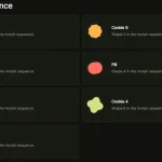 Material Design 3 Expressive Loading Indicator to React/Vue/Svelte/Vanilla JS
 Material Design Icon Picker in Vanilla JavaScript
 Material Design-style Time Picker Web Component – clock-timepicker