


A simplest pure CSS implementation of the Masonry- and Pinterest-like responsive grid layout.
How to use it:
Add your grid items to the Masonry layout as this:
<div class="masonry">
  <div class="item">
    <img src="1.jpg">
  </div>
  <div class="item">
    <div class="text-box">Text Block 1</div>
  </div>
  <div class="item">
    <img src="2.jpg">
  </div>
  <div class="item">
    <div class="text-box">Text Block 2</div>
  </div>
  ...
</div>
The core CSS styles:
.masonry {
  /* Masonry container */
  column-count: 4;
  column-gap: 1em;
  max-width: 1300px;
  margin: 0 auto;
}
.item {
  display: inline-block;
  background: #fff;
  margin: 0 0 1.5em;
  width: 100%;
  box-sizing: border-box;
  -moz-box-sizing: border-box;
  -webkit-box-sizing: border-box;
  box-shadow: 0px 1px 1px 0px rgba(0, 0, 0, 0.18);
  border-radius: 3px;
  -moz-border-radius: 3px;
  -webkit-border-radius: 3px;
}
.item .text-box {
  padding: 1.5em;
  padding-top: 8px;
}
Make the image and other elements responsive:
img, iframe {
  max-width: 100%;
  height: auto;
  display: block;
}
See Also:
 Responsive Masonry Layouts with CSS Grid and Mason-it.js
 Responsive CSS Masonry Grid Layout – Grid Overflow
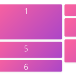 Minimal Masonry Web Layout In Pure JavaScript – MiniMasonry.js
 Easy Responsive Masonry Grid Library – Stackgrid
 Minimalist Masonry Gallery Layout With CSS Grid – mm-masonry.css
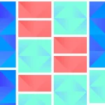 Tiny Responsive Masonry Grid Library – stack-up.js
 Simple Masonry Grid Layout With Flexbox – simple-masonry.js
 Mosaic Tiling With Image Lazy Loading – mosaicLayout