


This project utilizes the native <dialog> element to create nice clean animated modal windows using a little bit of JavaScript and CSS.
How to use it:
1. Create a dialog element on the page.
<dialog id="dialog">
  <header>
    My Modal Dialog
    <button class="btn btn-close" data-close>
      <svg width="16" height="16"><use xlink:href="#x"/></svg>
    </button>
  </header>
  Modal Content Here
</dialog>
<!-- Close button -->
<svg xmlns="http://www.w3.org/2000/svg" style="display: none;">
<symbol id="x" viewBox="0 0 16 16">
<path d="m1 1 14 14m0-14-14 14" stroke="currentColor" stroke-width="2"/>
</symbol>
</svg>2. Create a button to toggle the modal dialog.
<button data-toggle="#dialog">
  Open modal
</button>
3. The main CSS for the modal dialog.
/* Variables */
:root {
  --body-color: #333;
  --body-bg: #fff;
  --emphasis-color: #111;
  --accent-color: dodgerblue;
  --secondary-bg: #f5f5f5;
  --border-color: rgba(0,0,0,.15);
  --modal-padding-x: 1.25rem;
  --modal-padding-y: .75rem;
}
/* Dialog Styles */
dialog {
  position: relative;
  z-index: 100;
  width: 420px;
  max-width: 100%;
  padding: var(--modal-padding-y) var(--modal-padding-x);
  color: var(--body-color);
  background-color: var(--secondary-bg);
  background-clip: padding-box;
  border: 1px solid var(--border-color);
  border-radius: 0.5rem;
  box-shadow: 0 0.5rem 1rem rgba(0, 0, 0, 0.5);
}
dialog::backdrop {
  background-color: rgba(0, 0, 0, 0.5);
  animation: 0.5s fade-in;
}
dialog > header {
  position: -webkit-sticky;
  position: sticky;
  top: calc(var(--modal-padding-y) * -1);
  display: flex;
  justify-content: space-between;
  align-items: center;
  padding: var(--modal-padding-y) var(--modal-padding-x);
  margin: calc(var(--modal-padding-y) * -1) calc(var(--modal-padding-x) * -1) var(--modal-padding-y);
  font-weight: 600;
  color: var(--emphasis-color);
  background-color: inherit;
  border-bottom: 1px solid var(--border-color);
}
dialog > header [data-close] {
  margin-right: -0.25rem;
}
[open] + .backdrop {
  position: fixed;
  inset: 0;
  background-color: rgba(255, 0, 0, 0.25);
}
/* fading animation */
@keyframes fade-in {
  from {
    opacity: 0;
  }
  to {
    opacity: 1;
  }
}
4. The main JavaScript to open/close the modal dialog.
let toggler = document.querySelectorAll('[data-toggle]')
let closers = document.querySelectorAll('[data-close]')
if (toggler) {
  toggler.forEach(function (element) {
    let target = element.getAttribute("data-toggle")
    let targets = document.querySelectorAll(target)
    element.addEventListener("click", (event) => {
      targets.forEach(function (e) {
        e.showModal()
      })
    })
  })
  closers.forEach(function (element) {
    element.addEventListener("click", (event) => {
      let dialog = element.closest('dialog')
      dialog.close()
    })
  })
}
See Also:
 WAI-ARIA Compliant Dialog Box In JavaScript – a11y-dialog
 iOS Style Dialog Web Component – pure-dialog
 Modern Dialog Modals with Invoker Command API
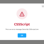 Create Custom Stylish Dialogs with SnapDialog JavaScript Library
 Easily Build Confirmation Popups with the confirmDialog.js Library
 Create Bootstrap 5 Modals Programmatically With JavaScript – bs_dialogs.js
 Moden Modal Window Using Dialog Element and CSS @starting-style
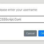 Async, Promise-based Alert/Confirm/Prompt Dialogs – Prompts.js