


responsive-tables.js is a pure JavaScript library for compressing your html table with multiple columns into a 2-column responsive table in small screens like mobile devices. Compatible with Bootstrap tables.
How to use it:
Load the responsive-tables.css CSS for the responsive table styles.
<link href="/path/to/responsive-tables.css" rel="stylesheet">
Load the JavaScript file responsive-tables.js in your html page when needed.
<script src="/path/to/responsive-tables.js"></script>
Just add the CSS class ‘responsive-table’ to any html table and the library will do the rest.
<table class='responsive-table'>
See Also:
 Make Bootstrap 5 Tables More Readable On Mobile Devices – AvalynxTable.js
 Tiny Responsive Table Web Component – table-saw
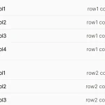 Pure CSS Responsive Solution – fluid-table.css
 Responsive Table Extension For Bulma Framework
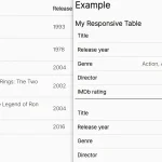 Responsive Accessible Table In Pure CSS
 Collapse Overflowing Table Columns Into A Dropdown – Podtablejs
 Responsive Table For Bootstrap 5 Framework
 Add Scroll Shadows To Wide HTML Tables – TableScrollShadow