


A pure CSS solution to style the native checkboxes and radio buttons using CSS / CSS3 rules and Font Awesome icons.
Features:
- Keyboard navigation supported (tab, arrows, spacebar).
- Styles for :hover and :active states to provide visual feedback.
How to use it:
Load the core stylesheet check-radio.css in the document’s head section.
<link rel="stylesheet" href="dist/check-radio.css">
Load the Font Awesome Icon Font in the document.
<link rel="stylesheet" href="font-awesome.min.css">
Create a group of radio buttons.
<label class="Form-label--tick">
  <input type="radio" value="1" name="SomeRadio" class="Form-label-radio" checked>
  <span class="Form-label-text">Option 1</span>
</label>
<label class="Form-label--tick">
  <input type="radio" value="2" name="SomeRadio" class="Form-label-radio">
  <span class="Form-label-text">Option 2</span>
</label>
<label class="Form-label--tick">
  <input type="radio" value="3" name="SomeRadio" class="Form-label-radio">
  <span class="Form-label-text">Option 3</span>
</label>
Create a group of checkboxes.
<label class="Form-label--tick">
  <input type="checkbox" value="1" name="SomeCheckbox" class="Form-label-checkbox">
  <span class="Form-label-text">Option 1</span>
</label>
<label class="Form-label--tick">
  <input type="checkbox" value="2" name="SomeCheckbox" class="Form-label-checkbox">
  <span class="Form-label-text">Option 2</span>
</label>
<label class="Form-label--tick">
  <input type="checkbox" value="3" name="SomeCheckbox" class="Form-label-checkbox">
  <span class="Form-label-text">Option 3</span>
</label>
See Also:
 Custom Checkboxes And Radio Buttons For Bulma Framework
 Create Stunning Checkboxes And Radio Buttons With Magic-Input CSS Library
 Pretty Checkbox & Radio Inputs with Bootstrap and awesome-bootstrap-checkbox.css
 Convert Checkboxes & Radio Buttons Into Grouped Buttons – boxed-check.css
 Custom Checkboxes, Radio Buttons, Switches In Pure CSS
 Custom Checkbox And Radio Inputs In Pure CSS
 Pretty Checkbox & Radio Button Replacement – Pretty.css
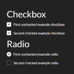 Animated Checkbox & Radio Button With Custom Marker