


A cool animated checkbox and radio button replacement that is styled with Font Awesome and animated with CSS3 transforms and keyframes. Created by allusis.
How to use it:
Include the required Font Awesome 4 in your document.
<link href="https://netdna.bootstrapcdn.com/font-awesome/4.1.0/css/font-awesome.min.css" rel="stylesheet">
Add several checkboxes and radio buttons into your document.
<label for="check-one">
  <input type="checkbox" name="check-one" id="check-one" value="checkone"/>
  <i></i> <span>Check One</span>
</label>

<label for="check-two">
  <input type="checkbox" name="check-two" id="check-two" value="check-two"/>
  <i></i> <span>Check Two</span>
</label>

<label for="check-three">
  <input type="checkbox" name="check-three" id="check-three" value="check-three"/>
  <i></i> <span>Check Three</span>
</label>

<label for="radio-one">
  <input type="radio" name="exampleRadios" id="radio-one" value="radio-one"/>
  <i></i> <span>Radio One</span>
</label>
<label for="radio-two">
  <input type="radio" name="exampleRadios" id="radio-two" value="doggie"/>
  <i></i> <span>Radio Two</span>
</label>
The required CSS/CSS3 rules to style & animate the checkboxes and radio buttons.
::-moz-selection {
 background: white;
}
::selection { background: white; }
@-webkit-keyframes
icon-beat {  0% {
 -webkit-transform: scale(2);
 -ms-transform: scale(2);
 transform: scale(2);
}
 100% {
 -webkit-transform: scale(1);
 -ms-transform: scale(1);
 transform: scale(1);
}
}
@keyframes
icon-beat {  0% {
 -webkit-transform: scale(2);
 -ms-transform: scale(2);
 transform: scale(2);
}
 100% {
 -webkit-transform: scale(1);
 -ms-transform: scale(1);
 transform: scale(1);
}
}
* {
  -webkit-box-sizing: content-box;
  -moz-box-sizing: content-box;
  box-sizing: content-box;
}
label {
  display: block;
  position: relative;
  padding: 0.5rem 1rem;
  line-height: 28px;
  font-weight: normal;
  cursor: pointer;
  -webkit-tap-highlight-color: transparent;
}
label:last-of-type { margin-right: 1rem; }
label i {
  display: inline-block;
  height: 25px;
  position: relative;
  top: 6px;
  font-style: normal;
  color: #ccc;
}
label span {
  display: inline-block;
  margin-left: 5px;
  line-height: 25px;
  color: gray;
}
input[type="radio"],
input[type="checkbox"] { display: none; }
input[type="radio"] + i:before,
input[type="checkbox"] + i:before {
  font-family: 'FontAwesome';
  font-size: 28px;
  height: 25px;
  width: 25px;
  display: inline-block;
}
input[type="radio"]:checked + i,
input[type="checkbox"]:checked + i {
  position: relative;
  -webkit-animation: icon-beat 0.1s ease;
  animation: icon-beat 0.1s ease;
}
input[type="radio"]:checked + i + span,
input[type="checkbox"]:checked + i + span {
  -webkit-transition: all 0.1s ease;
  transition: all 0.1s ease;
}
input[type="radio"] + i:before { content: "\f10c"; }
input[type="radio"]:checked + i:before { content: "\f111"; }
input[type="radio"]:checked + i + span,
input[type="radio"]:checked + i:before { color: rgba(0, 128, 128, 0.5); }
input[type="checkbox"] + i:before { content: "\f096"; }
input[type="checkbox"]:checked + i:before { content: "\f046"; }
input[type="checkbox"]:checked + i + span,
input[type="checkbox"]:checked + i:before { color: rgba(0, 128, 0, 0.5); }
See Also:
 Custom Checkboxes And Radio Buttons For Bulma Framework
 Create Stunning Checkboxes And Radio Buttons With Magic-Input CSS Library
 Pretty Checkbox & Radio Inputs with Bootstrap and awesome-bootstrap-checkbox.css
 Convert Checkboxes & Radio Buttons Into Grouped Buttons – boxed-check.css
 Custom Checkboxes, Radio Buttons, Switches In Pure CSS
 Custom Checkbox And Radio Inputs In Pure CSS
 Pretty Checkbox & Radio Button Replacement – Pretty.css
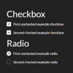 Animated Checkbox & Radio Button With Custom Marker
WoW, thanks, its awesome